
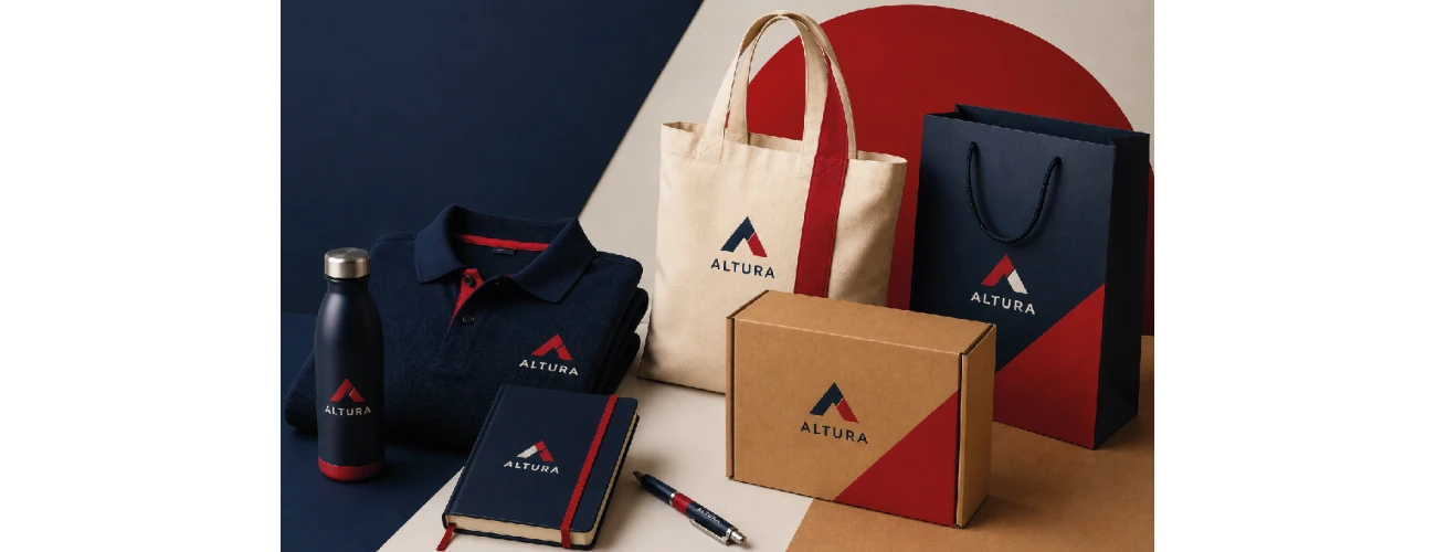
In summary
- Colour is one of the elements that makes a brand recognisable: to work well, it needs to stay consistent across promotional products, custom clothing, packaging and delivery materials.
- The same brand colour does not look identical on fabric, kraft paper, plastic or metal: the result changes with the material and the print method.
- Colour psychology can help guide the initial choice, but it is not enough on its own: what matters is how that colour is reproduced on real branded items.
- The strongest starting point is to define a small set of reference colours, including Pantone® and equivalent values, and check the result with an artwork proof before production.
Where are you applying your brand colour?
- Staff clothing, uniforms and events → custom clothing
- Giveaways, branded merchandise and promotional items → promotional products
- Boxes, trays and delivery packaging → custom cardboard boxes
- A coordinated range across several supports → promotional products, clothing and packaging chosen with the same palette and a consistent visual logic
Almost every company has a colour. It appears in the logo, on the website and on business stationery. Then that same colour is applied to a t-shirt, a paper bag, a box or a pen — and quite often it no longer looks exactly the same.
This is rarely the result of careless production. It is usually the way colour behaves on different materials. The same shade can look warmer on kraft paper, duller on dark fabric and slightly different on plastic or metal. When this step is not managed carefully, the brand can start to look fragmented even when each individual item is well made.
For this reason, colour should not be treated only as an aesthetic decision. It is a practical criterion that runs through the whole branded range: from the reference shade to the print method used on each support. It is the same principle behind a coordinated branded range, where promotional products, clothing and packaging share the same visual language.
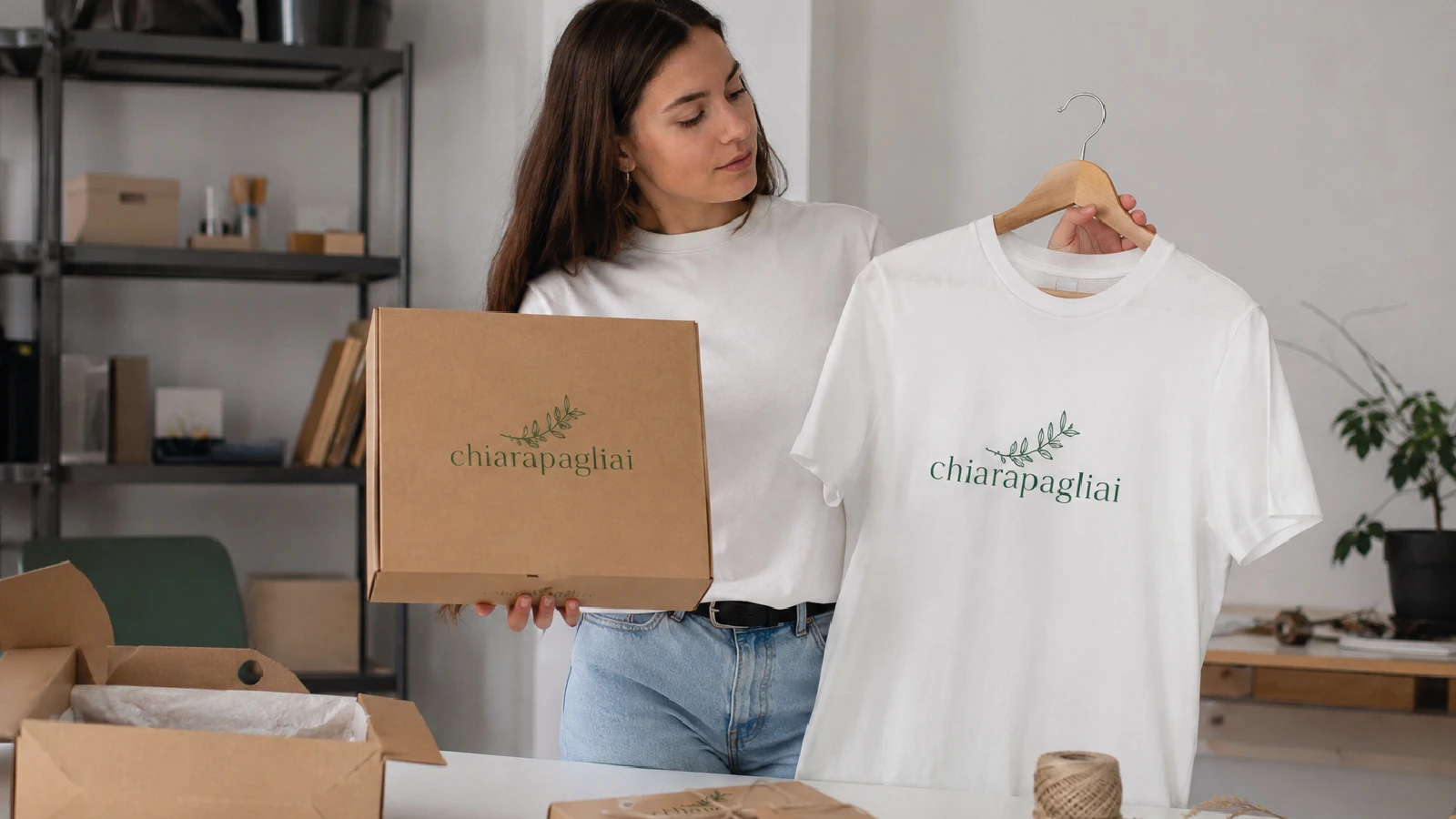
Colour is not just an aesthetic detail: it is a recognition asset
Colour is often the first thing a customer notices about a brand, even before reading the name. When a colour is used consistently over time, it becomes a recognition cue: it helps people connect a product, a garment or a package with the company behind it.
Colour psychology studies the associations that certain shades tend to suggest. Blue is often linked with reliability and professional or technical sectors, green with sustainability and natural products, red with energy and action, and black with restraint and premium positioning. These associations can be useful as a starting point, but they should be treated with care. The meaning of a colour also depends on the sector, the audience and the cultural context, and it never replaces consistency with the existing brand identity.
In practice, the real operational question is not only “which colour should we choose?” but “how do we reproduce that colour, in a recognisable way, across all the materials we use?” This is where many branded ranges lose consistency.
The same colour does not look the same on every material
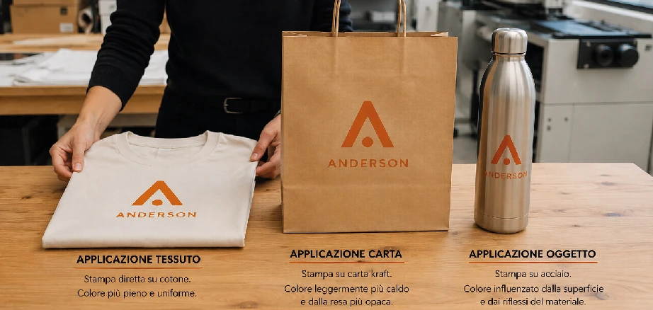
A colour may begin as a digital or printed reference, but it is then reproduced on very different surfaces. Each material has its own base colour, absorbency and finish. Understanding these differences in advance helps avoid surprises when the finished products arrive.


Fabrics: cotton, piqué and non-woven material
On fabric, the final colour depends heavily on the garment colour and the decoration method. On a light garment, the colour is generally more faithful; on a dark garment, a white underbase is often needed to prevent the shade from looking dull. Screen printing gives solid, opaque colours and can work well with Pantone® references for flat colours. Direct-to-garment printing (DTG) and DTF printing are better suited to gradients and multi-colour logos. Embroidery, on the other hand, uses thread colours: the closest thread from the available colour chart must be checked against the brand colour.
Paper and cardboard
With paper and cardboard, the base material plays a major role. White coated paper provides a neutral and faithful result; white packaging allows colours to appear brighter; brown kraft paper, commonly used for paper bags and natural-looking packaging, has a warm base that changes how the printed colour is perceived. For flat colours, offset printing with a Pantone® reference can provide good consistency. Digital printing is more flexible for smaller quantities and more complex images.
Plastic, metal, wood and bamboo
On promotional items, the decoration method often determines the colour result. Pad printing and UV printing can reproduce defined colours on pens, bottles and accessories. Laser engraving, by contrast, does not apply colour: it marks the surface and reveals the tone of the material underneath, such as metal, wood or bamboo. The result can be very refined, but it needs to be considered carefully when a brand relies on a precise colour. In that case, engraving communicates the logo shape, not the colour itself.
| Support | Typical methods | Colour result |
|---|---|---|
| Light fabric (cotton, piqué) | Screen printing, DTG, DTF | Generally faithful; solid colours with screen printing |
| Dark fabric | Screen printing with white underbase, DTF | Requires a white base to avoid dull colour |
| Brown kraft paper | Offset printing, digital printing | Warm base: colours look softer and warmer |
| White paper, white packaging | Offset printing (Pantone®), digital printing | Neutral and bright; good consistency with Pantone® |
| Plastic | Pad printing, UV printing | Defined colours; check the base colour of the item |
| Metal, wood, bamboo | Laser engraving, UV printing | Engraving does not add colour: it reveals the material tone |
How to translate brand colours onto personalised materials
The move from the “official” brand colour to the printed colour, repeated across several supports, usually follows four practical steps.
- Define the brand colour references. Set a small number of main colours and give each one a Pantone® reference, along with CMYK values for print and RGB/HEX values for digital use. A clear, limited palette is easier to keep consistent than a wide range of similar shades.
- Check the result on each material with an artwork proof. Before production, request a proof showing how the colour will appear on the actual support: light or dark fabric, white or kraft paper, plastic or metal. This is the stage where colour shifts can be identified and corrected.
- Choose the logo printing technique according to the support. Screen printing, pad printing, embroidery, UV printing and DTF do not reproduce colour in the same way. The method should be chosen according to the material and the palette, not only the price.
- Check consistency across the range before production. Place the different products, or their proofs, side by side and assess whether the colour works as a set. Small differences are normal; the important point is that the overall brand image remains recognisable.
What we have observed since 2006 about colour in branded supply projects
In many cases, colour problems do not begin during production. They begin earlier, when there is no precise Pantone® reference or when each order is managed separately without comparing the supports. In our experience, companies that define a small number of reference colours and check them with a proof before printing tend to achieve a more consistent result over time, especially when they order several different items. It is not about finding the “right” colour in absolute terms; it is about managing the brand colour with a clear method across every material.
Common mistakes when managing brand colour
- Relying only on the colour seen on screen, without a Pantone® or CMYK reference for print.
- Using too many shades: the more colours there are, the harder they are to keep consistent across different supports.
- Ignoring the base colour of the material, such as dark fabric, kraft paper or coloured plastic, and expecting the same result as on a white surface.
- Choosing the decoration method only by price, without considering how that colour performs on that support.
- Ordering different products at different times without comparing them as a coordinated range.
Brand colour consistency in a coordinated range
Colour shows its value most clearly when it runs across several supports at the same time. A coordinated range of promotional products, clothing and packaging — where branded merchandise, custom shopping bags, packaging and staff clothing share the same palette — communicates a stronger image than separate products that may be well made but visually disconnected.
The same applies to the clothing worn by people who represent the brand in front of customers. When branded workwear uses the same colours as the packaging and delivery materials, the brand becomes recognisable at every point of contact, from the shop floor to an event. In this sense, colour is one of the threads that holds the whole system together.
Colour also extends to finishing and delivery details: tissue paper, stickers, labels, ribbons and gift bags. Packaging supplies can be part of the same palette, completing the delivery experience without making the overall look feel heavy.
Questions to ask before placing an order
Before sending a branded range into production, a few practical questions help avoid the most common colour-related mistakes:
- Do I have a precise colour reference, such as Pantone®, CMYK and RGB/HEX values, or am I working from memory?
- Which materials will this colour be applied to, and what is their base colour?
- Does the chosen decoration method reproduce this colour accurately, or will it alter it?
- Have I requested an artwork proof to check the real result before production?
- Do the different products still look consistent when viewed together?
Shop for Shop is an Italian company active since 2006 and a direct supplier of personalised promotional products, custom clothing and packaging for businesses, shops and events. Treating colour as one shared criterion — rather than dealing with each support separately — is what turns each item from an isolated purchase into part of a consistent brand communication system.
Frequently asked questions
Why does the same brand colour look different on different materials?
Because every material has its own base colour and absorbency. The same colour can look warmer on kraft paper, duller on dark fabric and slightly different on plastic or metal. The printing or decoration method also affects the final result.
How can I keep colour consistent across promotional products, clothing and packaging?
It is best to define a small set of reference colours with Pantone® values and CMYK and RGB equivalents, then check the result on each material with an artwork proof before production and choose the most suitable decoration method for each support.
What is Pantone and why is it useful for brand colour?
Pantone® is a coded colour reference system. Providing a Pantone® code makes it easier to communicate the exact shade required and reduces colour differences between supports and between separate orders, especially for flat colours.
Which materials are most difficult for reproducing brand colours?
Dark fabrics are often more challenging because they may require a white underbase. Kraft paper has a warm base that changes the perceived colour. Laser-engraved items are also different because the process does not add colour; it reveals the tone of the material itself.
How many colours should a brand use on personalised products?
A small number of main colours is usually easier to manage than a large palette. A focused colour range simplifies reproduction across different supports and helps the brand remain recognisable over time.
Should colours be chosen before or after selecting the products?
It is useful to start from the brand’s reference colours and then test them on the chosen products, because some materials and decoration methods reproduce certain shades better than others. Product choice and colour choice should be considered together.
Leave a comment