
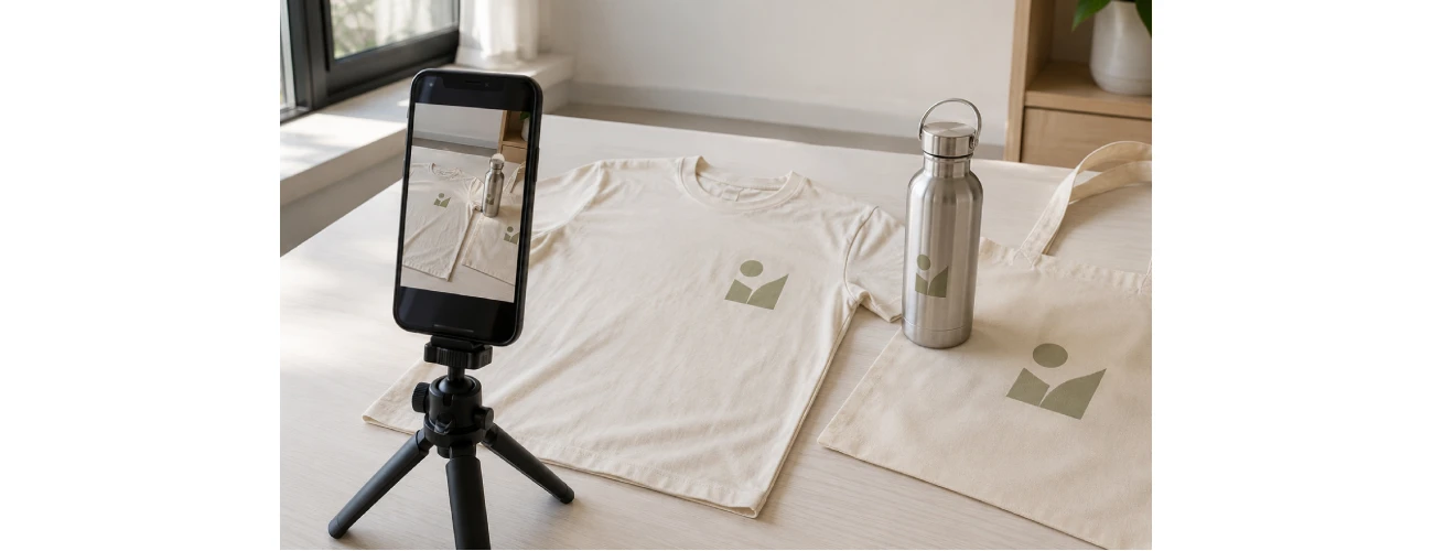
In brief
- Preparing the product has a greater impact on the final image than the equipment: a crease-free garment and a clean, well-positioned logo matter more than an expensive camera.
- Soft, diffused light is the most reliable option if you do not have a studio: it makes fabric texture, stitching and finishes easier to see.
- Logo colours should be checked both when shooting and during editing, because a screen does not automatically reproduce the actual printed colour accurately.
- Each platform crops images differently: shooting with extra space around the product makes it easier to create multiple formats without taking the photographs again.
- A well-organised shoot should produce more than one image: it should create a small reusable image library for future content.
Which photographs do you need to showcase personalised products on social media?
- A clear full-product shot → shows the shape, proportions and purpose of your promotional products
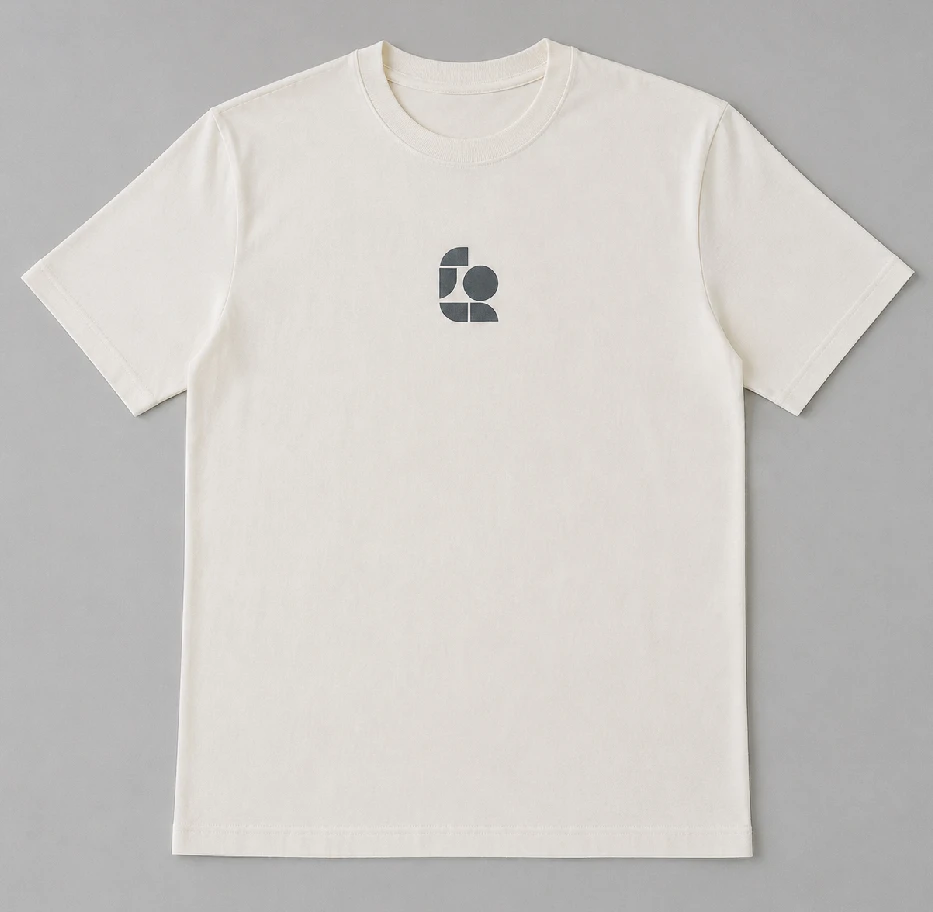
- A garment worn or carefully arranged → shows fit and logo placement on custom clothing
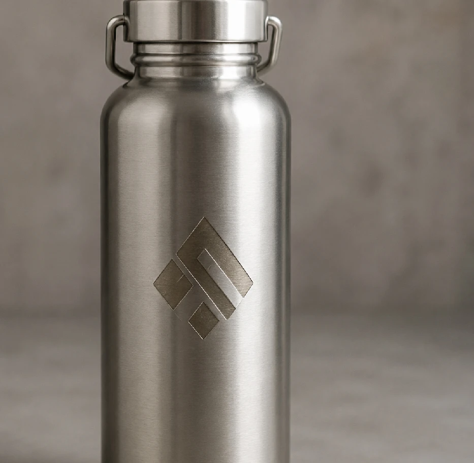
- A close-up of the personalisation → makes printing, embroidery, laser engraving and finishes easier to assess
- A realistic lifestyle or workplace shot → connects the product with staff, events, retail environments or deliveries
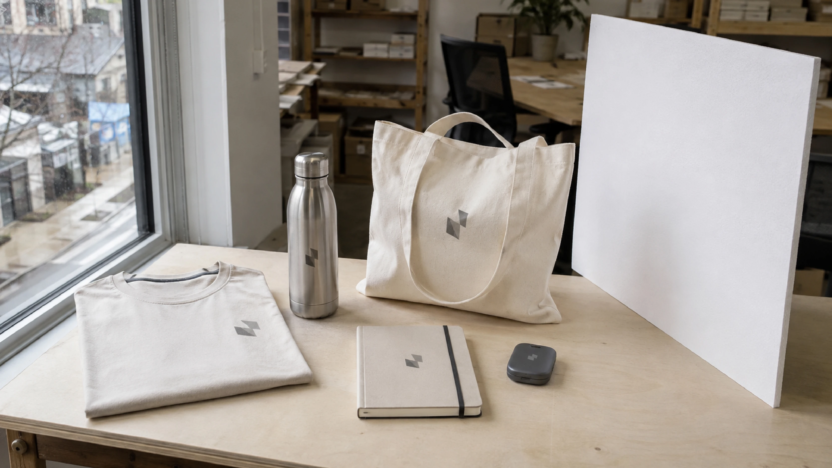
- A coordinated product arrangement → presents several items as parts of the same brand identity
To photograph promotional products and branded clothing effectively for social media, four things matter most, in this order: a properly prepared product, soft and consistent lighting, a background that does not compete with the subject, and deliberate control over how the logo colours are reproduced. The equipment comes afterwards. A recent smartphone used carefully can produce perfectly usable social media images; a better camera used badly will still produce photographs that need to be taken again.
A well-made personalised product can still look unconvincing in a photograph. The problem is often not the product itself, but harsh lighting, a distracting background, a crooked logo, a reflection hiding the engraving or an angle that makes it difficult to understand the product's size and purpose. When that happens, the quality of the work carried out before the photograph was taken does not come across in the final image.
What should a photograph of a personalised product communicate?
For business buyers, an image of a promotional product or branded garment performs three separate jobs. It shows what the product is, shows how the branding has been applied and communicates the level of care behind the supplier. The third point is often overlooked, yet it can influence purchasing decisions: buyers also use product photography to judge how carefully the rest of a supply project is likely to be handled.
This changes what makes a product photograph successful. It does not simply need to look attractive in an advertising sense: it needs to be clear and informative. The viewer should be able to recognise the material, understand the product's proportions, identify the branding technique and see the logo as accurately as possible.
Prepare the product before taking the photograph
Good preparation removes much of the need for editing later. It should happen before the shoot, not afterwards.
Clothing and textiles
Packaging creases are one of the most common problems when photographing branded clothing. A garment taken straight from its packaging often shows strong fold lines which become pronounced shadows in a photograph and can look like defects in the fabric. A quick steam before the shoot usually removes them.
Other useful checks include removing lint and loose fibres with a lint roller, aligning the side seams, making sure the collar sits correctly and hiding any visible tags. On a custom T-shirt, the logo should be aligned with the garment itself rather than simply centred within the camera frame. A logo that appears perfectly centred in the photograph but sits off-centre on the garment can make a correctly produced item look faulty.
Promotional products and hard surfaces
Glossy items such as reusable bottles, pens and metal promotional products easily pick up fingerprints, which become more obvious under side lighting. Wiping the item with a microfibre cloth before shooting usually solves the problem. Reflections also need attention: a polished metal surface may reflect the photographer or the surrounding room. Where possible, step further back and use a longer optical focal length rather than moving very close to the product. Digital zoom should be avoided because it enlarges the image without adding detail and can reduce the clarity of the logo.
Lighting matters more than the camera
If there is one variable worth spending time on, it is the lighting. Soft light coming mainly from one direction creates gentle shadows that describe the shape of the product without hiding its details. The simplest arrangement is a large window without direct sunlight, with the product positioned to the side of the window and a white reflector on the opposite side to soften the shadows. A sheet of white card can work perfectly well.
Two situations are best avoided where possible: direct sunlight, which creates hard shadows and can blow out pale details, and mixed lighting, such as daylight from a window combined with indoor lamps. Mixed light creates different colour casts across the same product because the light sources have different colour temperatures. If artificial lighting is being used, it is usually better to switch off the other light sources.
The background has one job: not to compete with the product. Light neutral grey is particularly versatile because it interferes very little with surrounding colours and works with both light and dark products. Three composition rules are especially useful: leave space around the product because each platform crops images differently; keep the camera parallel to the surface when photographing a garment as a flat lay; and include a recognisable sense of scale where appropriate, because business buyers often need to understand how large an item actually is.
The logo needs to be clear and colour-accurate
This is one of the most sensitive parts of product photography because a photograph can create expectations that the physical product cannot reproduce exactly. The appearance of a logo varies according to the material, decoration technique and surface, and no photograph automatically reproduces every colour perfectly. Three practical steps help reduce discrepancies.
- Set the white balance manually or use a neutral reference in the frame rather than relying entirely on automatic white balance. Automatic settings can change between photographs, meaning that the same red logo may look different from one image to the next.
- Avoid excessive saturation during editing. Increasing saturation may make the photograph more striking but can also make the real product look disappointing by comparison. If a Pantone® colour has been agreed, the photograph should aim to represent it realistically rather than make it appear stronger.
- Photograph the texture of the decoration technique, not just the logo itself. Embroidery can be recognised by the raised threads, screen printing by its printed surface and laser engraving by the contrast with the material beneath it. Slight side lighting reveals these differences much more effectively than completely flat frontal lighting.
Branded clothing: flat lay, mannequin or worn?
Each approach answers a different question. A flat lay is quick and highly controllable: it shows the artwork and proportions clearly and works particularly well for product catalogues and informative posts. A mannequin, including a ghost-mannequin presentation, gives a better idea of shape and fit and is useful when comparing a range of garments. A worn garment works particularly well for social media because it shows real context: retail staff, an event team or workwear being used in the workplace.
For business-focused content, combining them is often the most useful approach: one flat lay as the clear reference image and one worn shot to show the garment in context.
Image formats and aspect ratios for different channels
Cropping is where an otherwise good photograph can quickly become unusable. Platform specifications change over time, so current requirements should always be checked before a campaign. The more durable rule is simpler: shoot wider than you need and crop afterwards.
| Use | Orientation | Practical note |
|---|---|---|
| Social media feed | Portrait or square | Portrait images generally occupy more screen space on mobile devices |
| Stories and short-form video | Full portrait | Leave clear space at the top and bottom for interface elements and overlaid text |
| Professional social posts | Landscape or square | Square remains a flexible compromise across different platforms |
| Google Business Profile | Landscape, close to 4:3 | Very wide banner-style images are more likely to lose important parts of the subject when cropped |
| Website and e-commerce | Consistent across the product range | Using a consistent aspect ratio prevents uneven image heights within product grids |
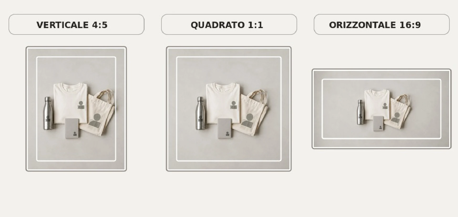
Turn one photoshoot into a reusable image library
Taking only one photograph means repeating the work every time a new piece of content is needed. A planned product photography session can instead create a small image library for social posts, sales presentations, email campaigns, Google Business Profile updates and internal communications. For each product or coordinated supply, it is useful to capture at least five types of image: an overview of the product or complete set; a portrait image with clear space for optional graphic copy; a close-up of the personalisation; an in-use or contextual image; and a neutral version without strongly seasonal elements so that it can be reused throughout the year.
File naming also makes the image library easier to manage. A descriptive filename such as stainless-steel-water-bottle-engraved-logo-event.jpg is much more useful than the automatic number generated by a smartphone. The archive should also distinguish between original photographs, approved images and versions that have already been cropped or adapted for individual channels.
How to organise a product shoot in seven steps
- Prepare the product. Steam the garment, remove lint and fingerprints, align seams and logos, and remove visible tags and packaging.
- Choose the lighting. Place the product beside a large window without direct sunlight and switch off competing light sources.
- Set the background. Use a plain neutral surface, such as light grey or white, without distracting patterns or textures.
- Lock the white balance. Set it manually or use a neutral reference so that the photographs remain consistent throughout the series.
- Compose with room to crop. Frame the shot wider than necessary and keep the camera parallel to the surface when photographing a flat-lay garment.
- Capture the complete set. Take an overall product shot, a close-up of the branding and, where useful, a photograph showing the product in context.
- Check the colours before publishing. Compare the photograph with the physical product in daylight and adjust exposure without artificially increasing saturation.
Frequently asked questions
Do I need a professional camera to photograph promotional products?
No. A recent smartphone is sufficient for most social media content provided that the lighting, background and product preparation are handled carefully. A professional camera offers genuine advantages for very fine details and difficult lighting conditions, but it cannot compensate for a poorly planned photograph.
What is the best lighting for photographing branded clothing?
Soft, diffused light coming mainly from one direction, such as a large window without direct sunlight, is one of the most practical options. It helps show fabric texture, stitching and the raised detail of embroidery. Direct sunlight and mixed daylight-and-lamp lighting are the two situations most worth avoiding.
How can I stop the logo colour looking different in the photograph?
Set the white balance manually or against a neutral reference, avoid excessive saturation during editing and compare the finished photograph with the physical product in daylight before publishing it. Screens and cameras cannot guarantee an exact reproduction of printed colours, so a visual check remains important.
Is it better to photograph clothing as a flat lay, on a mannequin or being worn?
It depends on the purpose. A flat lay is quick and shows the artwork and proportions clearly, a mannequin helps communicate shape and fit, and a worn garment shows real-life use and generally works particularly well on social media. For business content, combining at least one clear reference shot with one contextual photograph is often the most useful approach.
How many photographs do I need to present a personalised product?
Three provide a useful minimum: one complete product shot, one close-up of the branding and one image showing the product in use or in context. For a reusable content library, add a portrait photograph with clear space for graphic copy and a neutral version without strongly seasonal details.
Why do my product photographs get cropped badly on social media?
Because different platforms display and crop images using different aspect ratios. Taking the original photograph wider than necessary and leaving clear space around the product makes it possible to create several versions from the same image without cutting off the subject.
How should businesses handle photographs that include recognisable people?
If identifiable people appear in photographs intended for publication, it is sensible to agree the intended use in advance, explain the channels on which the images may appear and keep a written record where appropriate. The requirements can vary according to the context, purpose and market, so unusual or sensitive situations should be checked separately.
What we have observed since 2006 when businesses photograph personalised products
One recurring mistake is leaving photography until the very end of the project and taking a few quick photographs immediately before the products are dispatched or distributed. This misses the opportunity to document the details, branding techniques and coordination between different items. The most useful photographs are usually produced when the shoot is treated as part of the supply process itself: the products are prepared, the details that need to remain visible are identified and several compositions are photographed before the items are handed to staff, shipped to the customer or taken to an event. Another frequent issue is format: perfectly usable photographs are taken with proportions that do not allow the required social media crop, so they have to be taken again after the campaign has already started.
If you are preparing a coordinated range of branded water bottles and insulated bottles, custom bags and branded clothing, it makes sense to plan the product photography alongside the supply itself. Photographing the whole range in one session, using the same lighting and background, saves time and creates a consistent set of images. The same principle applies to a coordinated range of promotional products, clothing and packaging: products designed to work together should also be photographed as a coherent system.
Leave a comment